

Office color matching formulas that bosses must know
Click:
Time:2024-11-14 11:27:17
In a fast-paced workplace environment, the color matching of the office not only affects the beauty of the space, but is also directly related to the mood and work efficiency of employees. Knowing how to use colors reasonably can make your office environment both professional and full of vitality. Today, we will reveal several classic office color matching formulas for you to give your office a brand new look!
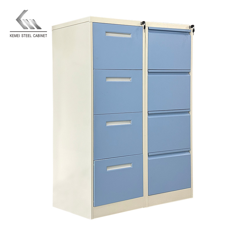
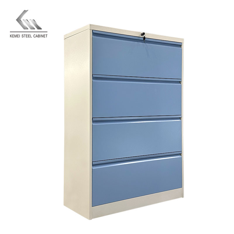
1. Classic matching: blue + white
Blue symbolizes trust and professionalism, and matching with white can create a clean and bright visual effect, which is very suitable for industries such as finance and law that need to create a sense of trust. The blue and white combination also helps to reduce stress and improve employee concentration, and is suitable for meeting rooms, rest areas and other areas.
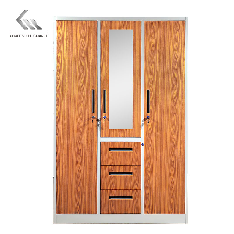
2. Modern matching: gray + wood grain color
Gray tones are low-key and professional, while wood grain colors give the space a sense of warmth, which is an ideal choice for technology and creative industries. The gray and wood combination can alleviate the coldness of modern industrial style, add warmth and texture to the office, and enhance the overall sense of luxury of the space.
3. Vibrant matching: green + gray and white
Green brings vitality and soothing effects, especially suitable for work environments that require innovation and active thinking. The combination of gray and white can balance the vitality of green, which is neither too stimulating nor dull, and is very suitable for open office areas and tea rooms.
4. Calm combination: black + metallic color
Black symbolizes authority and power, and can be matched with metallic colors to add texture and modernity, which is suitable for independent offices of senior management. The calm black makes the space look grand, while the embellishment of metallic colors enhances the overall grade and highlights professionalism and aura.
Kemei Tips: In terms of office color matching, it is recommended to use 70% of the main color, 20% of the auxiliary color, and 10% of the embellishment color. This "70-20-10" ratio makes the space more layered and does not appear messy.

点击右上角
分享给朋友吧


 Long by picture save/share

 Kitty
Kitty